visual appeal | layout & placement of elements
VISUAL APPEAL
- Koi -
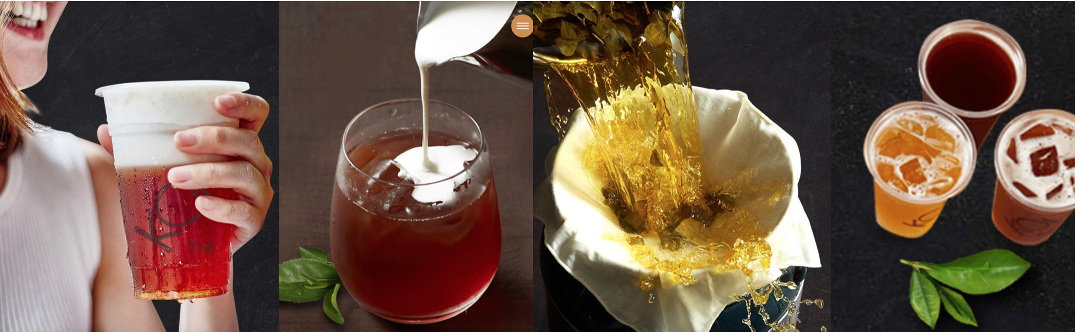
On the front page background, one of the photos being using in the slideshow is that of three people having a great time drinking KOI together. This aligns with their emphasis on “fun” and captivates younger audience who often gather as groups for an after-meal or mid-day drink. Also, most of the photos used are large in comparison with the text paragraphs, thereby creating a visual contrast to appeal to audiences and draw their attention to the teas in the photos.
- Gong Cha -
There are different-styled fonts being used for text headings and text body, which to me, personally, does not appeal.
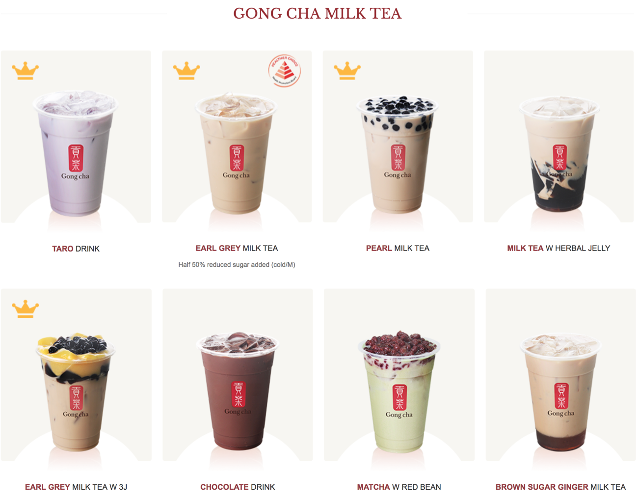
The full listing of all of Gong Cha’s drinks includes a picture of each drink, which visually attracts and entices someone craving a bubble tea.
- Yuan Cha -
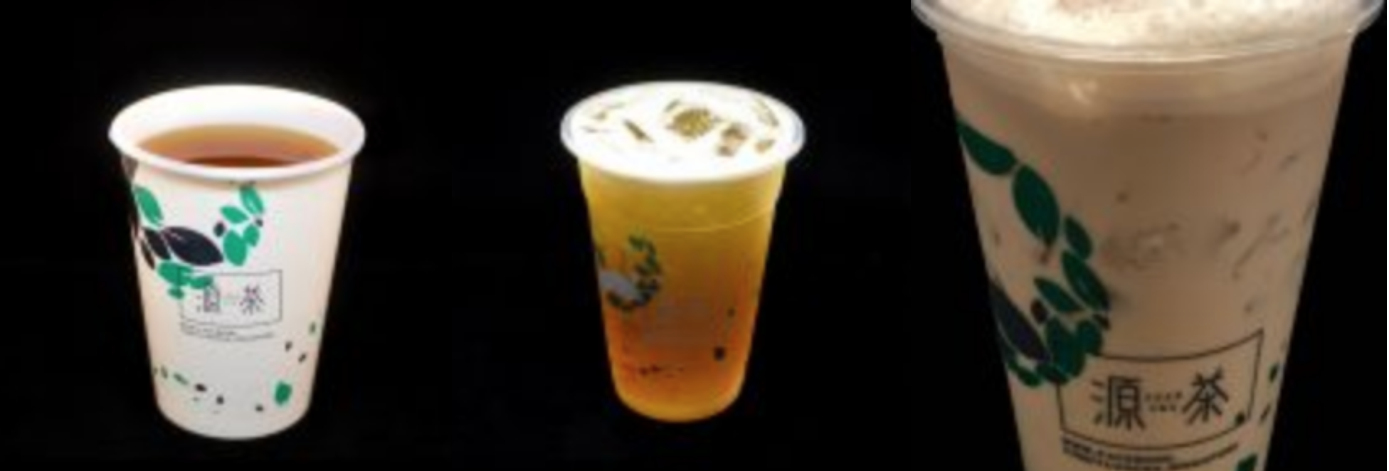
There is little images used, and coupled with the white backgrounds, this creates a very clean and light website. The only large photograph used is that of a tea plantation on the front page, which gives the impression of “natural sources”, “fresh tea” and “tea quality”. However, the use of images on the “Drinks Menu” is not effective. The images were not consistent in their composition (two images show the entire cup while one image shows a zoom-in) and the images used were too small for any details to be shown.
LAYOUT AND PLACEMENT OF ELEMENTS
- Koi -
There are various photos of tea in different forms, all of which showcase “fresh”, “refreshing” and “enticing”. On the “About Us” page, there is also use of a gif background to retain attention. Additionally, one can find in most pages, the use of a “leaf” image either in photo or as an icon, which is consistent with KOI’s logo.
- Gong Cha -
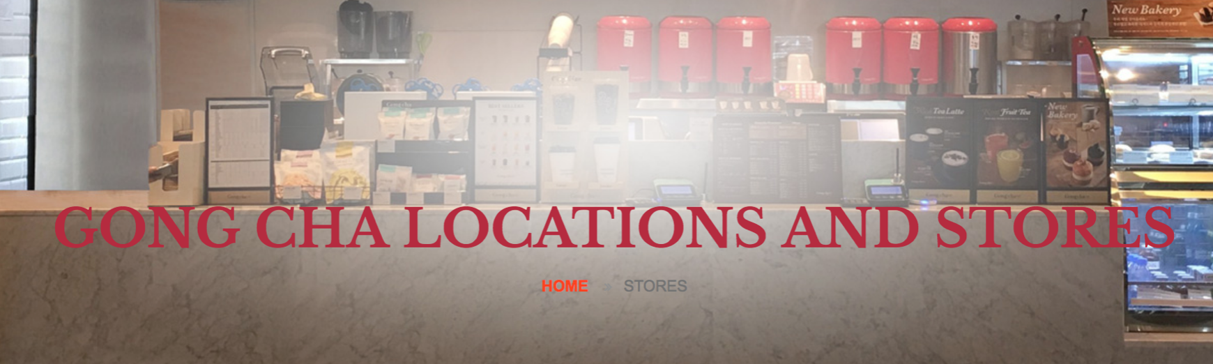
The headings for most of the pages are placed against a photograph background. However some of the headings are badly placed, which reduces the readability of the text or covers a part of the focus of the background.
- Yuan Cha -
There is a right-side panel on all pages which shows links to some of the site’s contents. It is similar to blogpost style, however this panel is somewhat redundant as it does not include links to important information which audiences may be interested in. Additionally, this panel takes up space on all pages and it draws attention away from the main content on the left side of each page.