
LOADING SPEED
- Koi -
The loading speed of the entire page is fast. On some pages, there is use of animation to present the content. The speed of the animation is just right to draw the attention of audiences.
- Gong Cha -
The loading speed of the page is slower compared to KOI’s page. There are transition animations between all pages and it is unclear if this is impeding the loading speed of the pages.
- Yuan Cha -
The site is content-light and loads relatively fast.
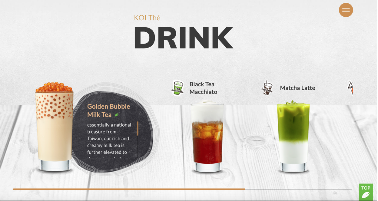
NAVIGATION
- Koi -
The site is designed in a “scroll-through” format, wherein from the front page, the audience is able to access all information with one scrolling action. However on the “Drink” page, scrollbars are also used for the description of each drink, which makes it a little difficult to scroll-through — wanted to scroll through the drink description but the entire page gets scrolled instead. There is also a horizontal scrollbar used for scrolling through different featured drinks. Perhaps a “listing” of all its featured drinks (like Gong Cha — see review below) will be easier to navigate than the use of multiple scroll bars.
- Gong Cha -
There are links to Gong Cha’s Facebook and Instagram pages in the footer. This helps increase connectivity with the current “social media-trendy” generation. The top navigation bar is fixed despite scrolling down pages, this provides easy and quick access to the links from anywhere on the page.
- Yuan Cha -
Yuan Cha’s page has the navigation bar fixed at the top of the page for easy access (like Gong Cha), however this is only available on the front page. This reduces the ease in navigation. However, the front page of the website features two dedicated links to “Drinks Menu” and “Brand Story”, with the “Drinks Menu” button colored green for emphasis. This draws audience to the content that Yuan Cha wants to highlight.
Yuan Cha also provides a link to its Facebook page. However the link to its Instagram page does not work, which perhaps would be better removed.